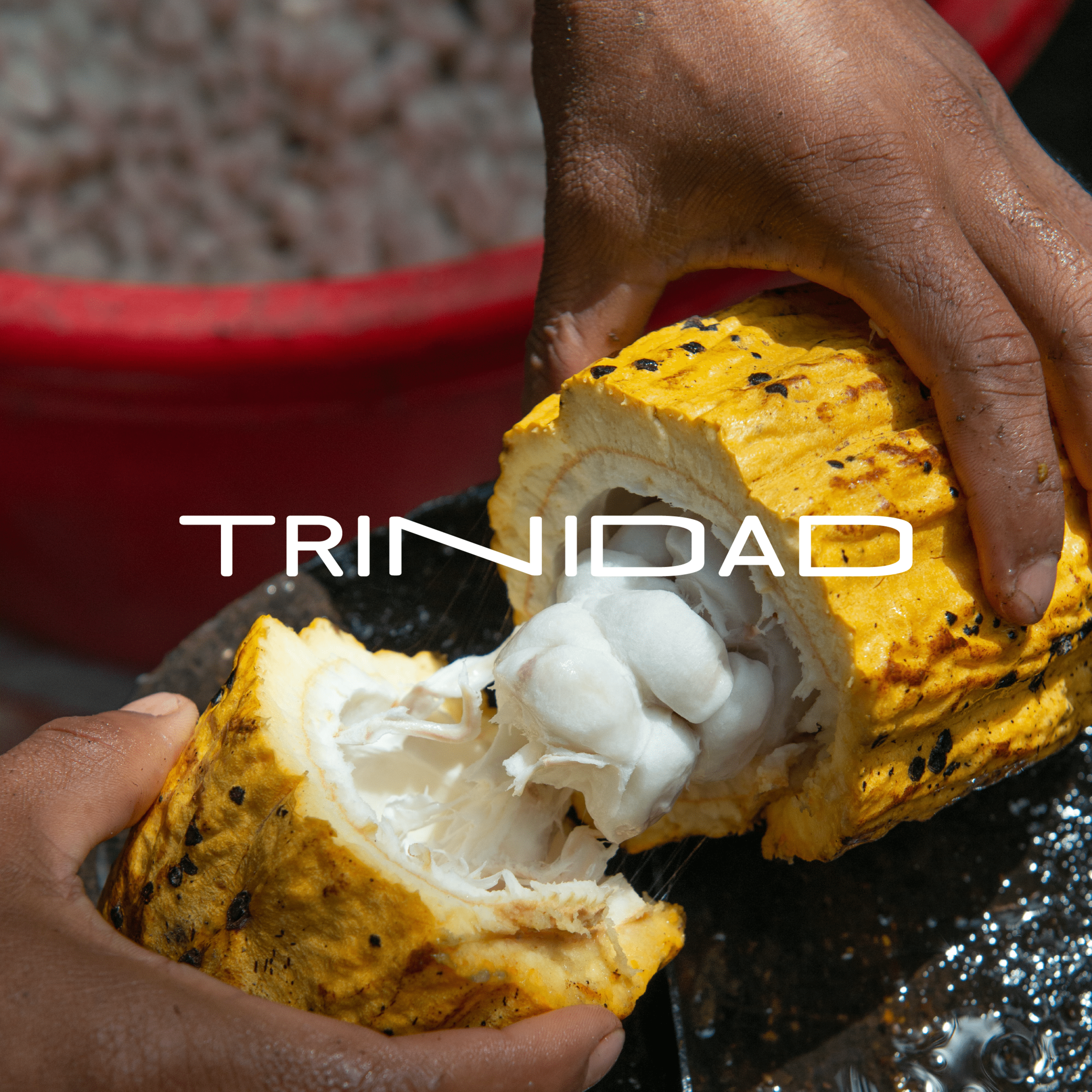
the concept
Of the many things that make Trinidad unique, our cadence and use of language stand as the most memorable of them all. It’s the sing in our song, the stress in our syllables and the casualty in our lexicon. Home or foreign, we can never truly escape what is inherently ours. This brand identity therefore pays homage to our ongoing song.
The Brand
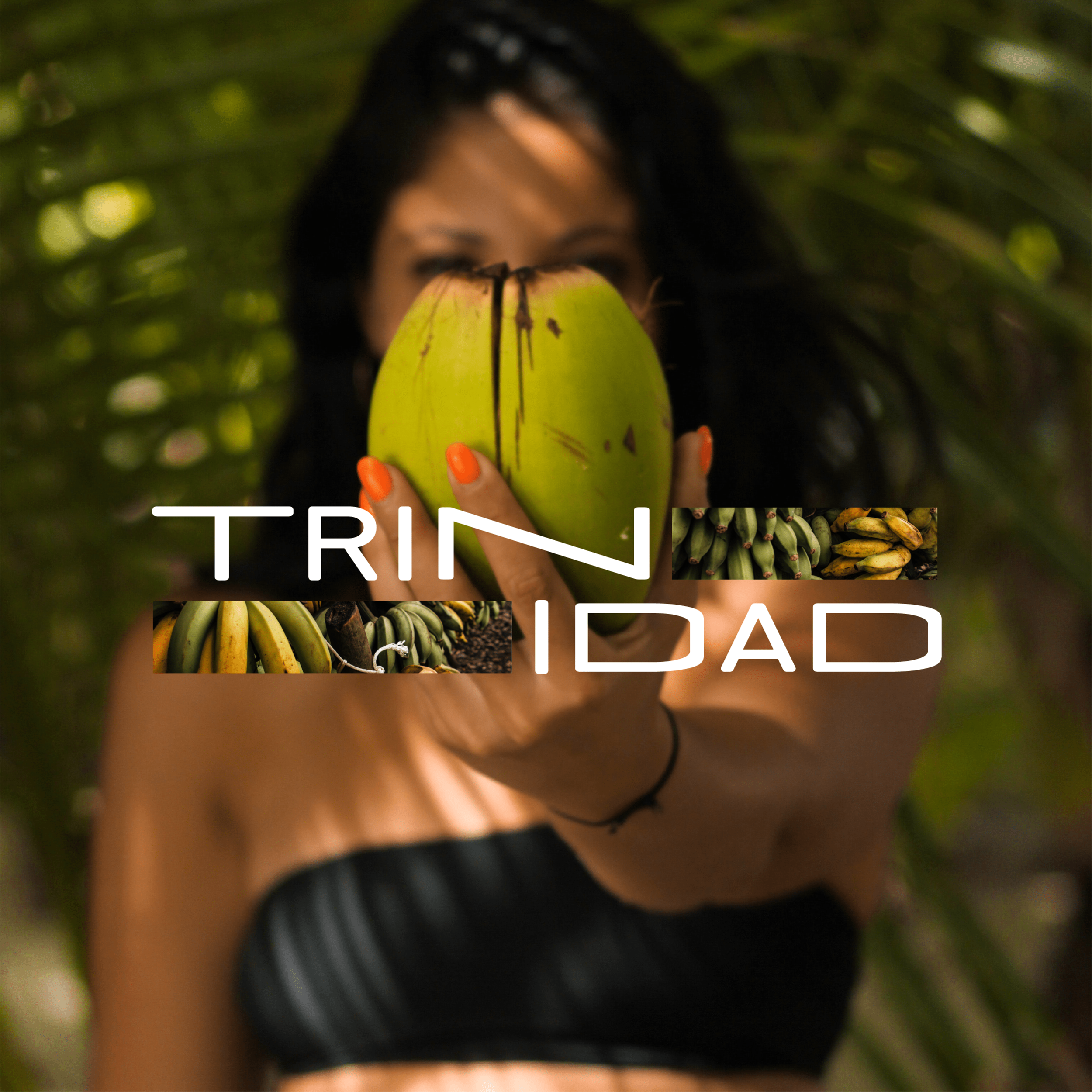
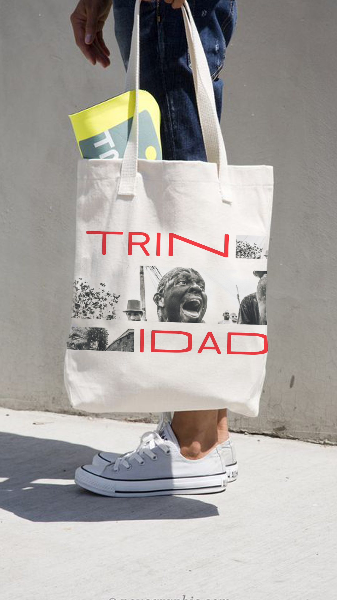
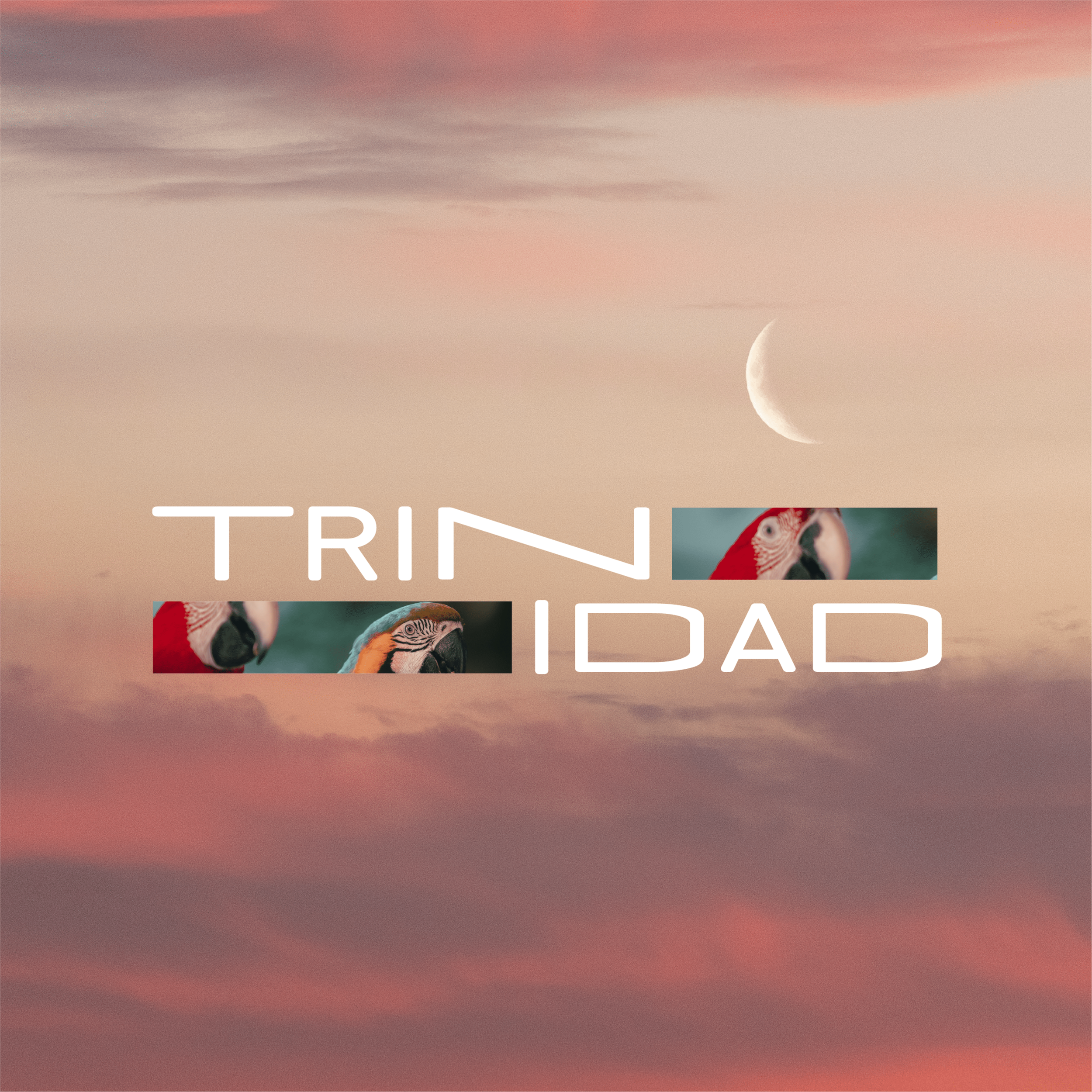
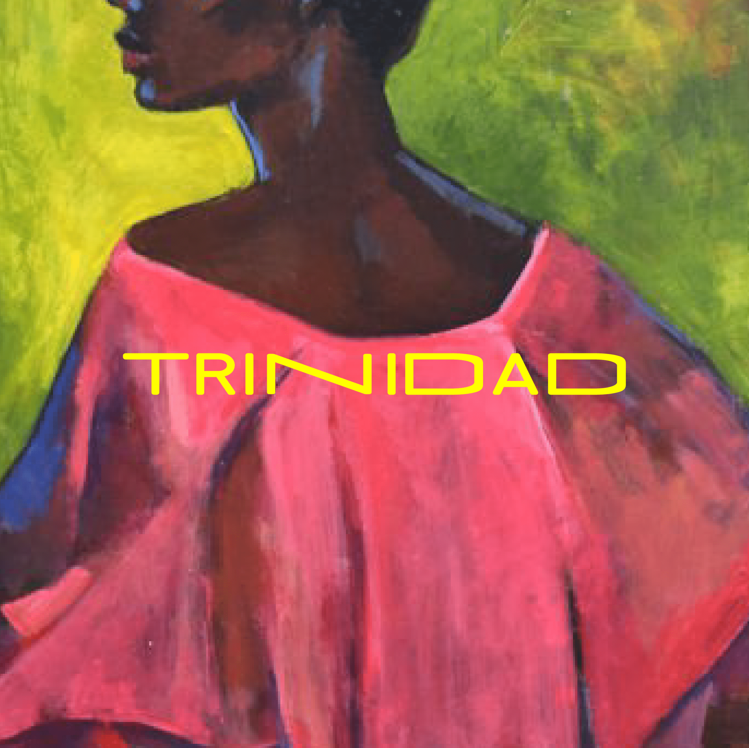
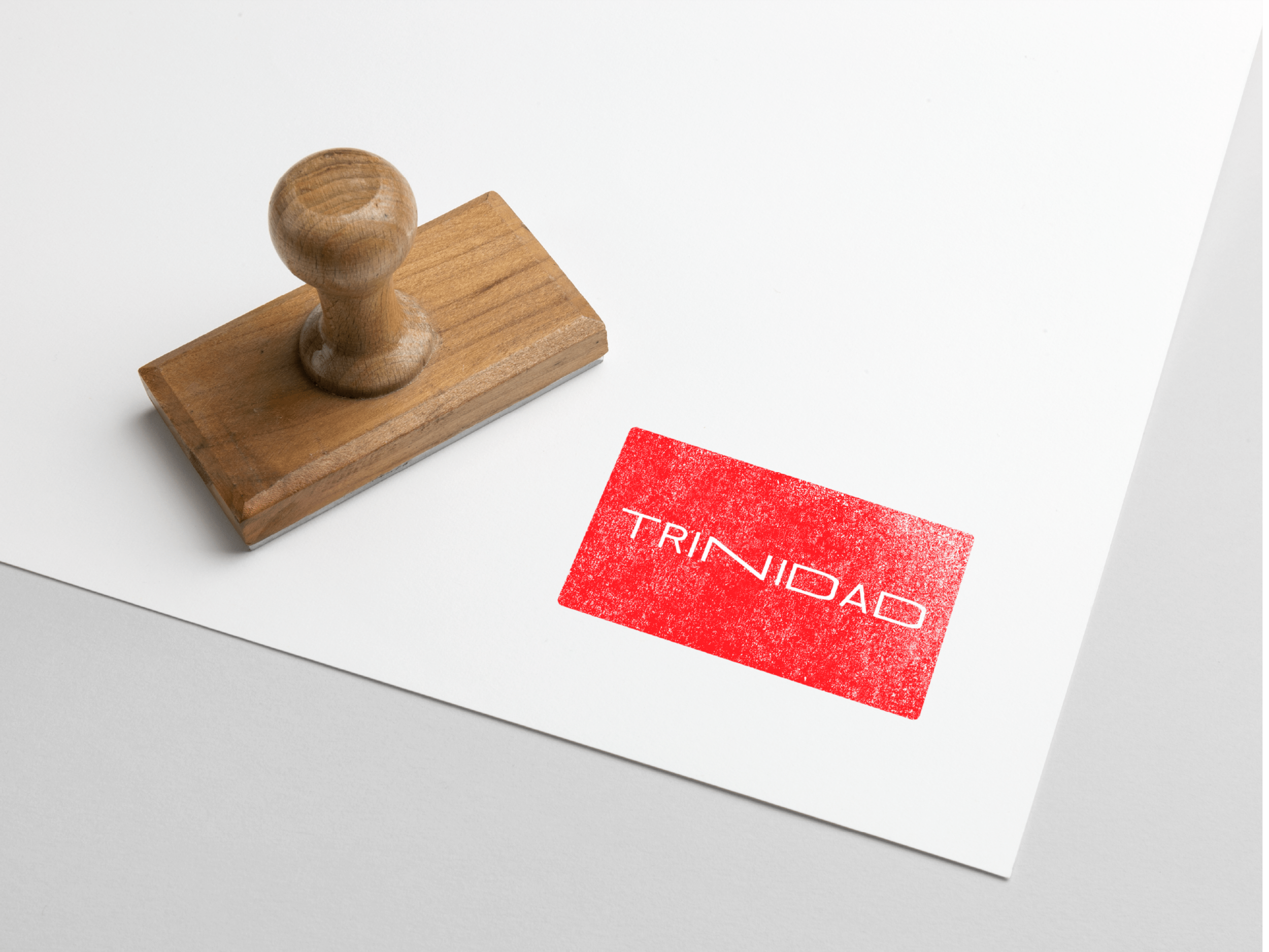
As the rationale goes, this logotype was heavily influenced by the Trinidadian accent. During the research process, I’d documented multiple ways of saying Trinidad (from Trinidadians, of course) and wanted the overall structure of the word to mirror what was recorded.
This thereafter sets an overall direction to the brand as it becomes reactionary to the platform in which it exists.
To read more on the design process, click here.
Client: Lonsdale Saatchi & Saatchi
To read more, visit:


